Slope Search makes planning ski trips effortless. It simplifies the process of comparing resorts and ticket options into a clear, intuitive experience, helping you spend less time stressing and more time on the slopes.

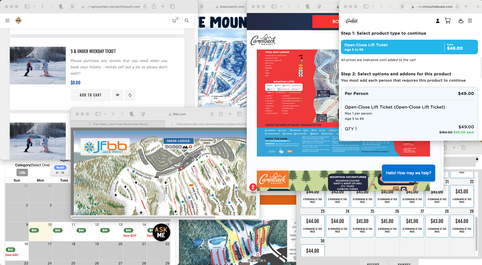
Buried in Tabs? So Were We.
Whether it was one person or five, planning a ski day got chaotic fast. We talked to solo riders, weekend warriors, and group trip planners. Everyone was juggling tabs, scrolling outdated websites, and stuck in group chats asking, “Wait, who’s booking?”
It was messy, confusing, and no one felt in control. So we cleaned it up.

The People Behind the Powder
Every great ski day starts with people, and ours come with their own quirks.
After digging into research and chatting with real‑life skiers, three personalities kept popping up: the master planner who runs the trip like a CEO, the social butterfly who just wants to know where to show up, and the pass‑wielding tactician who treats snow days like a stock portfolio.
These three are not just characters. They are the reason every feature in Slope Search exists.


With our skiers in mind, we designed Slope Search to tackle their quirks, crush their pain points, and make every ski day feel like it was built just for them.
The Solution: Slope Search
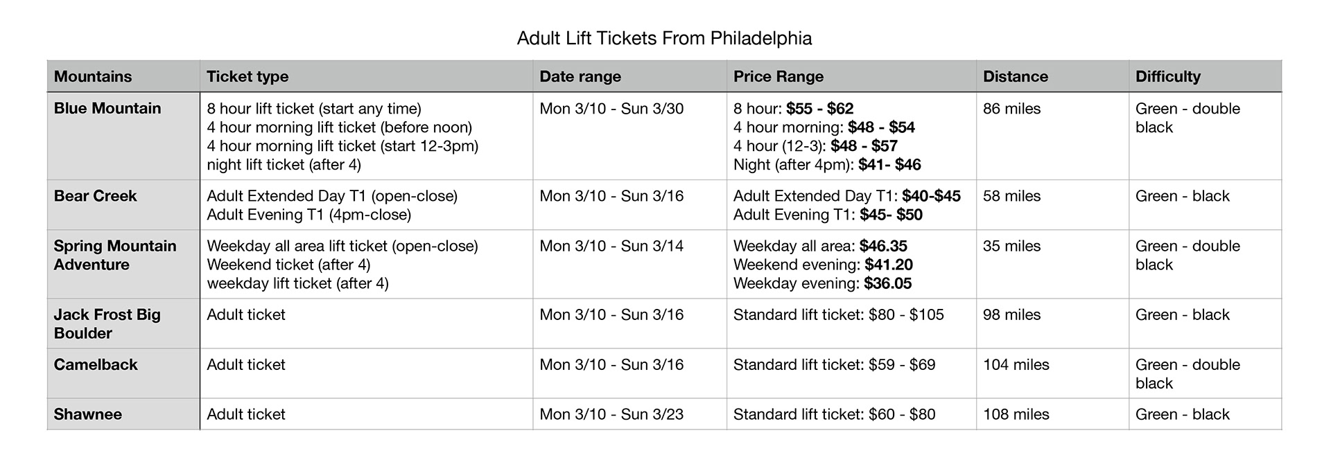
Slope Search makes it easy to see what a day on the mountain will actually cost. No hunting around or clicking through five resort websites just to get a straight answer. Just one clear view of who’s open, how much tickets cost, distance, and details that matter.
The interface is built to be simple. Clean design and quick filters make it so intuitive your grandmother could use it, and she doesn’t even ski. It works without a learning curve. Just open it, and you’re already halfway to the slopes.


Not Every Mountain Plays by the Same Rules
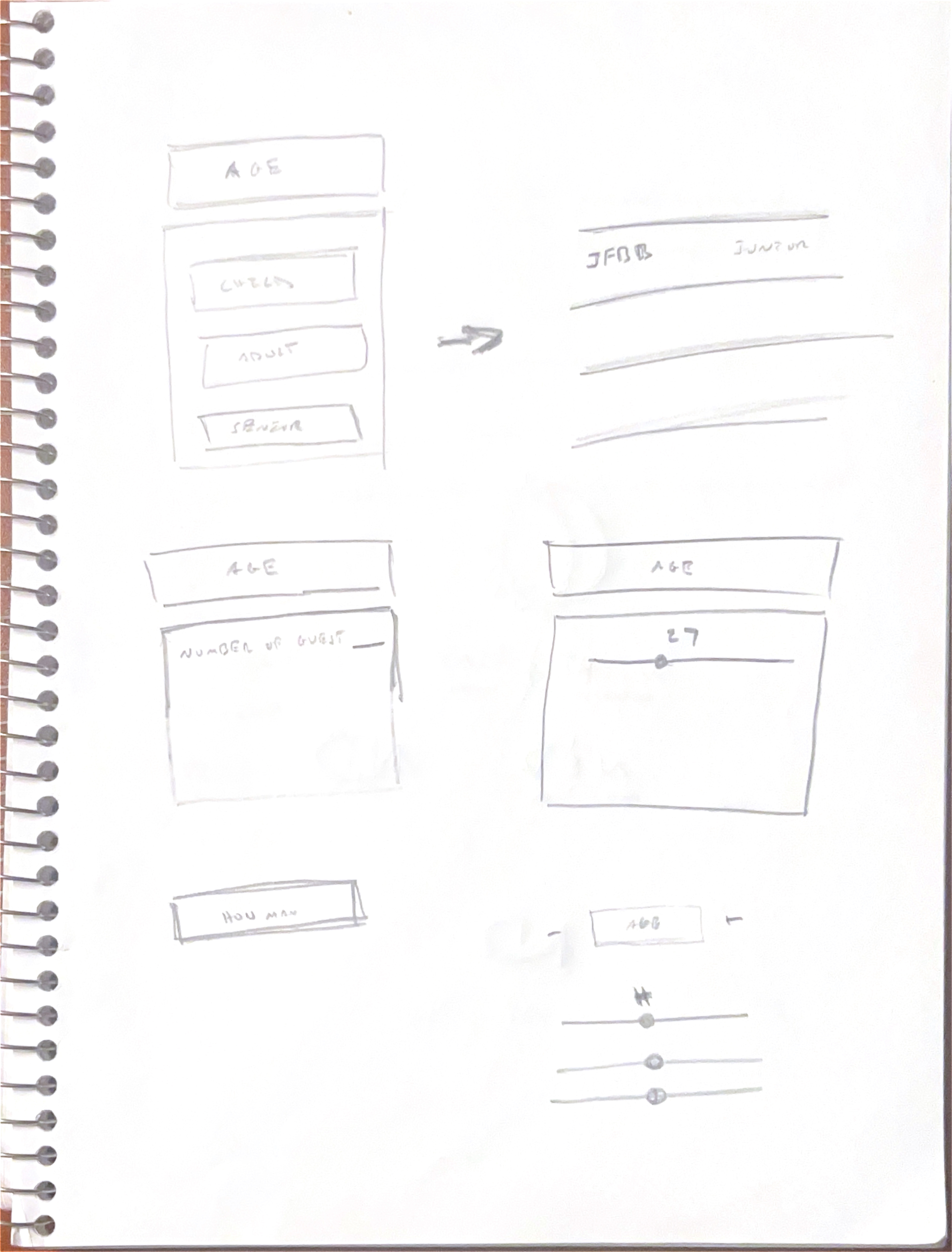
Every resort defines ticket categories differently. Some use “Child,” “Youth,” and “Adult.” Others throw in extras like “Junior,” “Teen,” or “Senior.” There’s no standard. Just a mess of overlapping definitions.
Instead of asking users to pick a category and guess wrong, I designed the search bar to ask for age directly. Behind the scenes, it maps that input to each resort’s logic. Up front, it stays clean and simple: just location, date, and number of people.
No dropdown overwhelm. No confusion. Just a search bar that works the way people think.

From Idea to Interface
I led the UX, UI, and brand design for Slope Search from the ground up. That included the core interface, visual identity, and a system flexible enough to scale with future features.
User interviews and edge case mapping shaped early decisions. I designed a responsive layout and collaborated with developers to align the system with resort data and future APIs.
This project pushed me to think like a product owner, not just a designer. It challenged me to balance clean design with real-world complexity and create something that works for both users and business partners.
The Result
93% faster ski trip planning
In early user testing, Slope Search reduced trip‑planning time from an average of 36 minutes to just under 3 minutes. More chairlift rides, fewer browser tabs
Behind The Screens
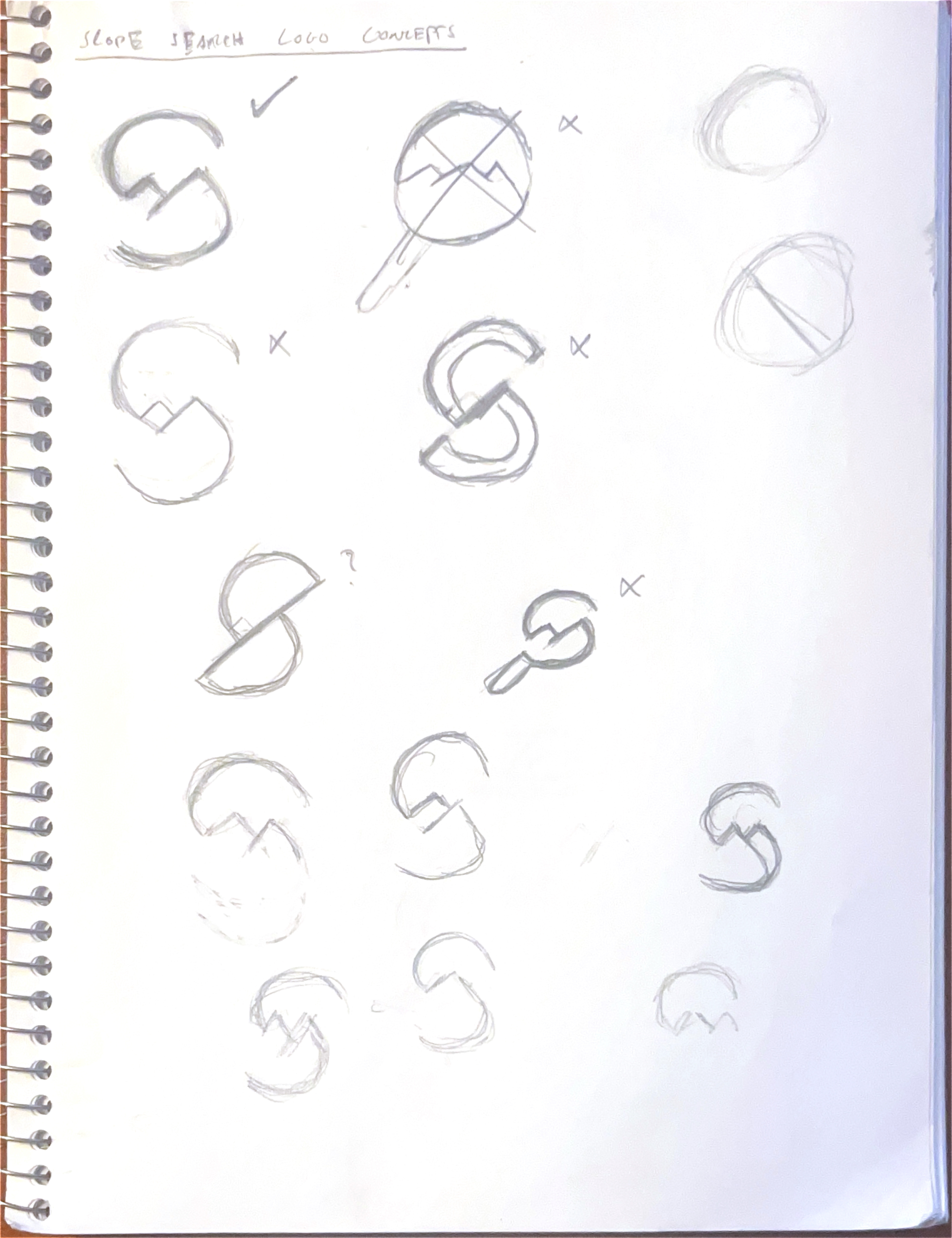
Before the pixels, there were Post-its. Every idea started in my sketchbook, mapped out before it ever hit the screen. This is where the early work lives: rough sketches, UI experiments, ideas that worked, and plenty that didn’t.
No polish, just process. These are the messy layouts and weird ideas that shaped Slope Search into something real, one honest screen at a time.


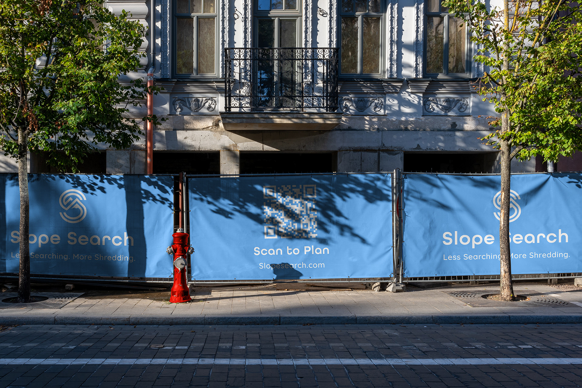
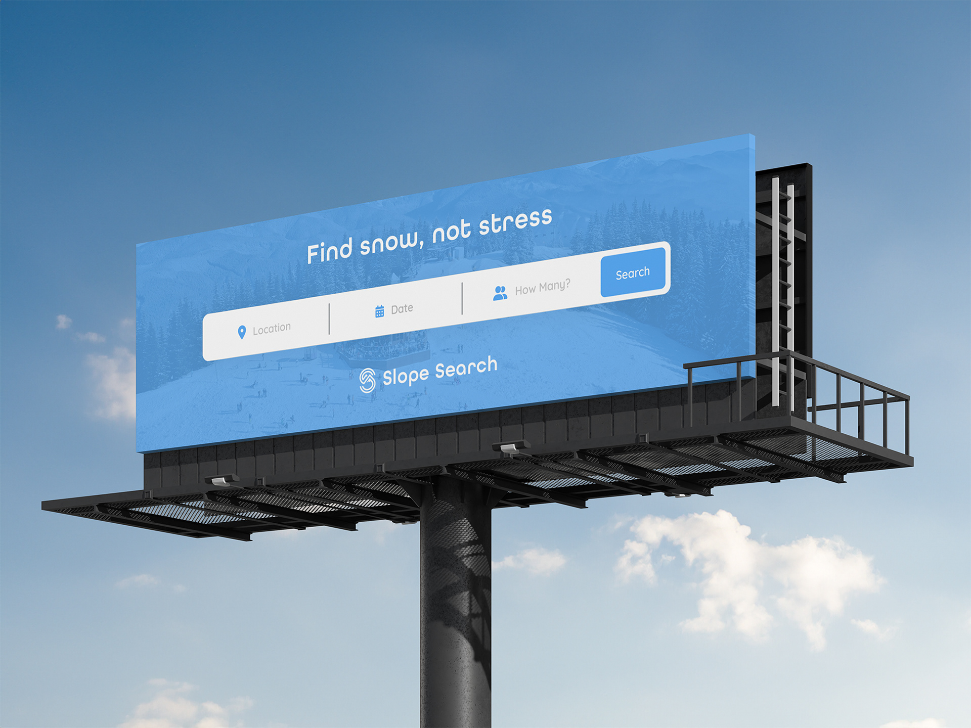
Slope Search in the Wild
We brought the brand into the real world and gave it a voice on the street. Billboards, bus stops, and construction wraps designed to stop people in their tracks. Simple visuals. Bold headlines. No fluff.
The goal? Make it feel like Slope Search already exists. Like it’s the thing you didn’t know you needed until you saw it yelling at you from a sidewalk.


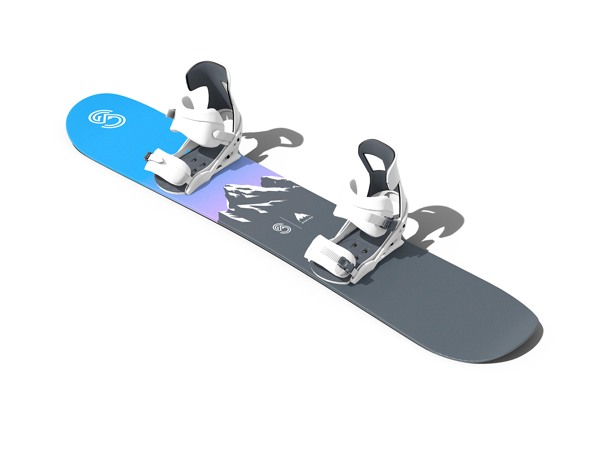
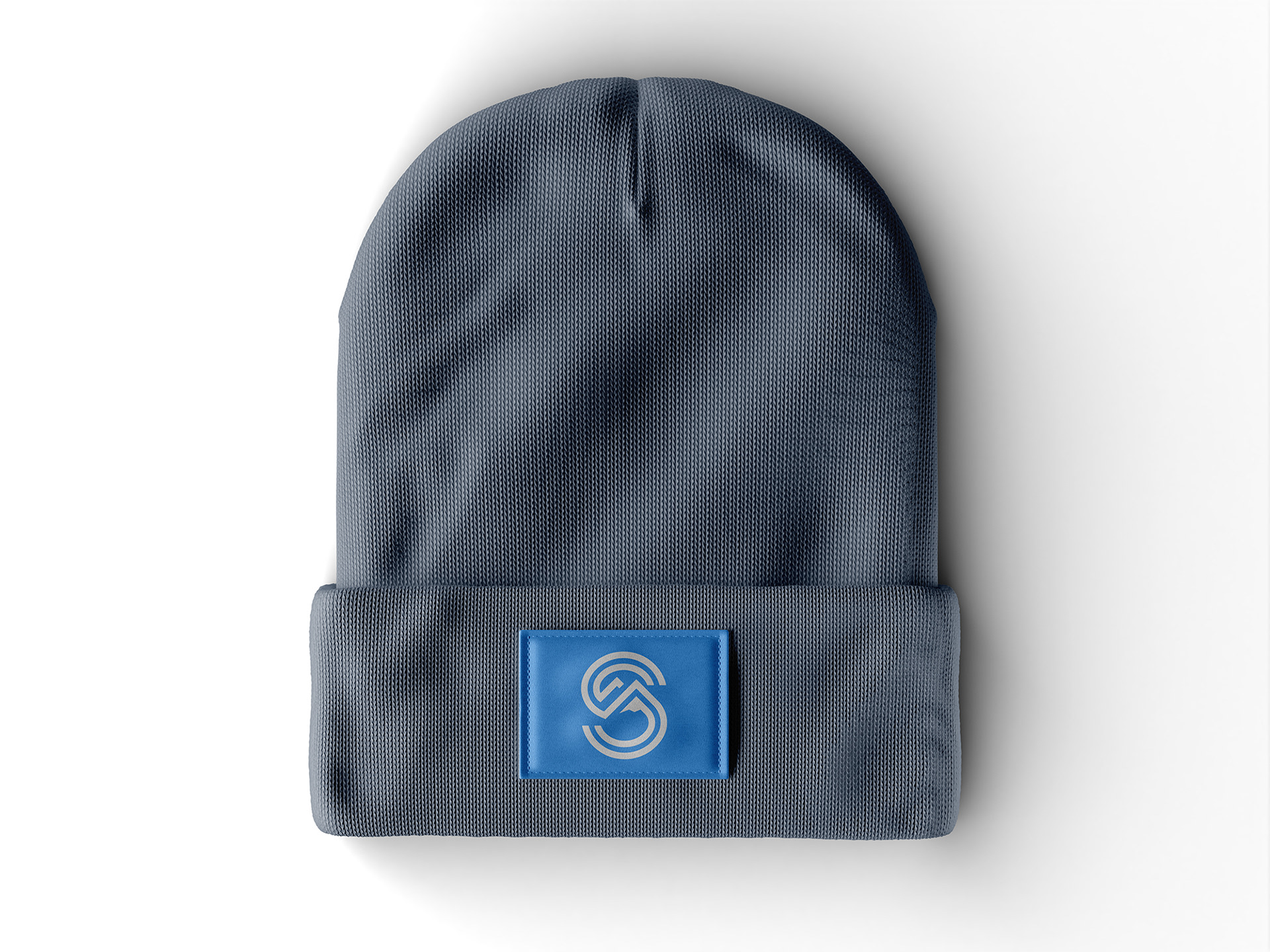
Fresh Gear for the Frost
Good branding should live everywhere, so we made sure it could. Skis, boards, hoodies, beanies, and jackets were all designed as natural extensions of the brand. If it didn’t feel like something you'd actually wear in the lift line, we scrapped it.


Still Scrolling?
You’re either really into UX design or just avoiding doing your laundry. Either way, Go to slopesearch.com to join the waitlist and be the first to know when we drop.